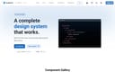
Wix Design System
comprehensive Figma library of UI components and guidelines for consistent Wix app designs.
Product Overview
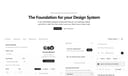
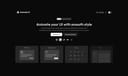
Wix Design System (wixdesignsystem.com) is an official open-source design system from Wix, providing a unified set of UI components, patterns, and guidelines to ensure consistent, accessible, and scalable designs across Wix's ecosystem of apps and tools. It empowers designers and developers to build high-quality user experiences with reusable elements, focusing on modularity and collaboration. The system includes Figma files for prototyping and a comprehensive documentation site for implementation details. Component Library: Over 100 reusable UI components like buttons, forms, navigation, and modals, with variants for states and accessibility. Guidelines: Detailed specs for colors (semantic palette), typography (font scales, hierarchy), icons (custom set with SVGs), spacing, and motion. Figma Integration: Downloadable Figma kit for rapid prototyping and design handoff. Documentation: Interactive guides for usage, best practices, and code snippets in React.
Best For
Guidelines: Detailed specs for colors (semantic palette), typography (font scales, hierarchy), icons (custom set with SVGs), spacing, and motion. Figma Integration: Downloadable Figma kit for rapid prototyping and design handoff. Documentation: Interactive guides for usage, best practices, and code snippets in React.
Key Features
- Component Library: Over 100 reusable UI components like buttons, forms, navigation, and modals, with variants for states and accessibility.
- Guidelines: Detailed specs for colors (semantic palette), typography (font scales, hierarchy), icons (custom set with SVGs), spacing, and motion.
- Figma Integration: Downloadable Figma kit for rapid prototyping and design handoff.
- Documentation: Interactive guides for usage, best practices, and code snippets in React.
Pros
- +Open source
- +Real-time collaboration
- +Extensive icon library
- +Scalable vector formats
Cons
- -Adoption requires team alignment
- -Customization can be complex
/// SPECS
- Pricing:Free
- Platform:Browser
Vuetify
Vuetify is a complete Vue.js UI framework that strictly adheres to Material Design guidelines, offering a rich set of components and powerful customization capabilities.
shadcn/ui
shadcn/ui is a unique collection of composable React UI components, offering copy-and-paste code that is highly customizable and seamlessly integrates with Tailwind CSS.
Animate UI
Animate UI is a free open-source React component library with Tailwind and Framer Motion animations, inspired by shadcn/ui, to effortlessly elevate web interfaces.
AWS Amplify
Figma components for building Amplify-powered apps with consistent AWS design language.
Airtable UI Kit
Figma components for designing Airtable-integrated apps with consistent UI patterns.
Backstage Design System
Figma kit for Backstage developer portals with UI components and guidelines.

Base Gallery
Figma community file showcasing a collection of UI components for design inspiration and prototyping.
Naive UI
Naive UI is a Vue 3 component library recommended by Evan You, offering beautiful, high-performance, and highly customizable components, entirely written in TypeScript.

Animalia DS
comprehensive design system for consistent UI components and guidelines in Animali apps.
Element Plus
Element Plus is a desktop UI component library designed for Vue 3, offering rich, elegant enterprise-grade components to efficiently build management systems.