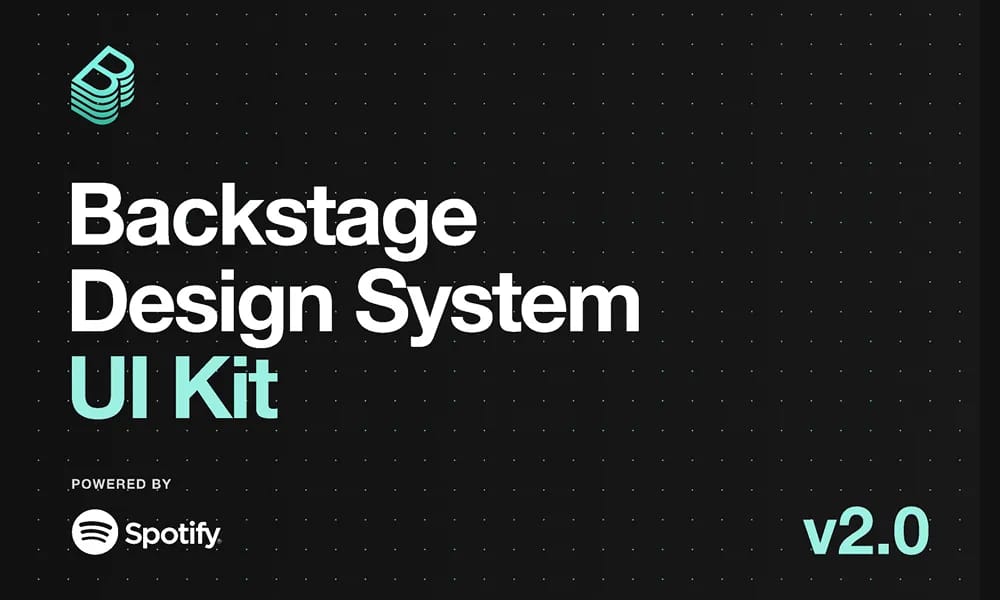
Backstage Design System
Figma kit for Backstage developer portals with UI components and guidelines.
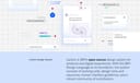
Product Overview
The Backstage Design System is a community Figma file providing a comprehensive design system for Backstage, Spotify's open-source developer portal framework. Created by the Backstage team, it includes reusable UI components, patterns, and guidelines to ensure consistent, scalable interfaces for software catalogs, tech docs, and plugins. With thousands of views, it's ideal for developers and designers building internal tools, focusing on modularity, accessibility, and CNCF-aligned standards. Component Library: Elements like cards, tables, navigation, buttons, and charts with variants for themes and states. Design Tokens: Colors, typography, spacing, and icons based on Backstage's principles. Prototyping Support: Auto-layout and interactions for rapid portal prototyping. Guidelines: Best practices for developer experience and integration.
Best For
Design Tokens: Colors, typography, spacing, and icons based on Backstage's principles. Prototyping Support: Auto-layout and interactions for rapid portal prototyping. Guidelines: Best practices for developer experience and integration.
Key Features
- Component Library: Elements like cards, tables, navigation, buttons, and charts with variants for themes and states.
- Design Tokens: Colors, typography, spacing, and icons based on Backstage's principles.
- Prototyping Support: Auto-layout and interactions for rapid portal prototyping.
- Guidelines: Best practices for developer experience and integration.
Pros
- +Open source
- +Real-time collaboration
- +Extensive icon library
- +Color palette generation
Cons
- -Adoption requires team alignment
- -Customization can be complex
/// SPECS
- Pricing:Free
- Platform:Browser
Animate UI
Animate UI is a free open-source React component library with Tailwind and Framer Motion animations, inspired by shadcn/ui, to effortlessly elevate web interfaces.
AWS Amplify
Figma components for building Amplify-powered apps with consistent AWS design language.
Airtable UI Kit
Figma components for designing Airtable-integrated apps with consistent UI patterns.

Base Gallery
Figma community file showcasing a collection of UI components for design inspiration and prototyping.

Atlassian Design System
comprehensive guidelines and Figma components for consistent, accessible product interfaces.
Carbon Design System
IBM's open-source UI framework for consistent, accessible enterprise products.

Cloudscape Design System
AWS open-source UI framework for consistent, accessible enterprise cloud applications.

Elastic UI
open-source React framework for consistent, accessible enterprise interfaces.

Animalia DS
comprehensive design system for consistent UI components and guidelines in Animali apps.

Wix Design System
comprehensive Figma library of UI components and guidelines for consistent Wix app designs.