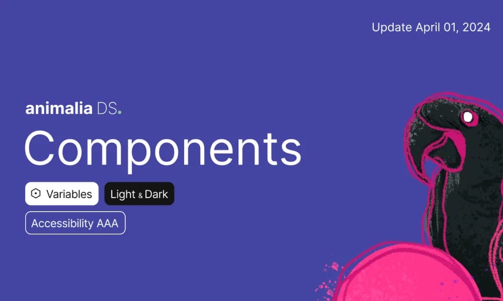
Animalia DS
comprehensive design system for consistent UI components and guidelines in Animali apps.
Product Overview
Animalia DS (doc.animaliads.io) is the official documentation for Animalia's design system, providing a unified framework for building consistent, accessible user interfaces across Animali products and apps. It includes detailed guidelines, component libraries, and best practices to ensure scalability and brand alignment for designers and developers. Component Library: Reusable UI elements like buttons, forms, navigation, and cards with variants. Style Guidelines: Specs for colors, typography, spacing, icons, and motion. Accessibility: ARIA-compliant components and inclusive design principles. Integration: Figma files and code snippets for rapid prototyping.
Best For
Style Guidelines: Specs for colors, typography, spacing, icons, and motion. Accessibility: ARIA-compliant components and inclusive design principles. Integration: Figma files and code snippets for rapid prototyping.
Key Features
- Component Library: Reusable UI elements like buttons, forms, navigation, and cards with variants.
- Style Guidelines: Specs for colors, typography, spacing, icons, and motion.
- Accessibility: ARIA-compliant components and inclusive design principles.
- Integration: Figma files and code snippets for rapid prototyping.
Pros
- +Extensive icon library
- +Color palette generation
- +Accessibility contrast checking
- +Smooth animation capabilities
Cons
- -Adoption requires team alignment
- -Customization can be complex
/// SPECS
- Pricing:Free
- Platform:Browser
shadcn/ui
shadcn/ui is a unique collection of composable React UI components, offering copy-and-paste code that is highly customizable and seamlessly integrates with Tailwind CSS.
Animate UI
Animate UI is a free open-source React component library with Tailwind and Framer Motion animations, inspired by shadcn/ui, to effortlessly elevate web interfaces.
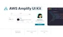
AWS Amplify
Figma components for building Amplify-powered apps with consistent AWS design language.
Airtable UI Kit
Figma components for designing Airtable-integrated apps with consistent UI patterns.

Backstage Design System
Figma kit for Backstage developer portals with UI components and guidelines.

Base Gallery
Figma community file showcasing a collection of UI components for design inspiration and prototyping.

Atlassian Design System
comprehensive guidelines and Figma components for consistent, accessible product interfaces.
Carbon Design System
IBM's open-source UI framework for consistent, accessible enterprise products.
Cloudscape Design System
AWS open-source UI framework for consistent, accessible enterprise cloud applications.

Wix Design System
comprehensive Figma library of UI components and guidelines for consistent Wix app designs.