Airtable UI Kit
Figma components for designing Airtable-integrated apps with consistent UI patterns.
Product Overview
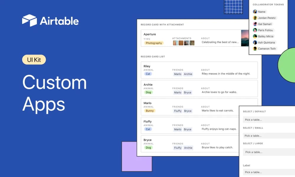
The Airtable Apps UI Kit is an official Figma community file from Airtable, providing a comprehensive library of UI components tailored for building apps within the Airtable ecosystem. It enables designers and developers to create consistent, scalable interfaces for data-driven applications, including elements like tables, forms, dashboards, and navigation aligned with Airtable's design principles. With thousands of views, it's ideal for prototyping Airtable extensions, interfaces, and custom apps, ensuring accessibility and responsiveness. Component Library: Pre-built elements like data tables, input fields, buttons, modals, and charts with variants for states and themes. Design Tokens: Colors, typography, spacing, and icons based on Airtable's guidelines. Prototyping Support: Auto-layout and interactions for rapid wireframing and developer handoff. Accessibility: Semantic components with ARIA support for inclusive design.
Best For
Design Tokens: Colors, typography, spacing, and icons based on Airtable's guidelines. Prototyping Support: Auto-layout and interactions for rapid wireframing and developer handoff. Accessibility: Semantic components with ARIA support for inclusive design.
Key Features
- Component Library: Pre-built elements like data tables, input fields, buttons, modals, and charts with variants for states and themes.
- Design Tokens: Colors, typography, spacing, and icons based on Airtable's guidelines.
- Prototyping Support: Auto-layout and interactions for rapid wireframing and developer handoff.
- Accessibility: Semantic components with ARIA support for inclusive design.
Pros
- +Extensive icon library
- +Color palette generation
- +Accessibility contrast checking
- +Comprehensive design system
Cons
- -Adoption requires team alignment
- -Customization can be complex
/// SPECS
- Pricing:Free
- Platform:Browser
shadcn/ui
shadcn/ui is a unique collection of composable React UI components, offering copy-and-paste code that is highly customizable and seamlessly integrates with Tailwind CSS.
Animate UI
Animate UI is a free open-source React component library with Tailwind and Framer Motion animations, inspired by shadcn/ui, to effortlessly elevate web interfaces.
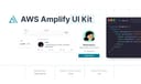
AWS Amplify
Figma components for building Amplify-powered apps with consistent AWS design language.

Backstage Design System
Figma kit for Backstage developer portals with UI components and guidelines.

Base Gallery
Figma community file showcasing a collection of UI components for design inspiration and prototyping.

Atlassian Design System
comprehensive guidelines and Figma components for consistent, accessible product interfaces.
Carbon Design System
IBM's open-source UI framework for consistent, accessible enterprise products.

Naive UI
Naive UI is a Vue 3 component library recommended by Evan You, offering beautiful, high-performance, and highly customizable components, entirely written in TypeScript.

Animalia DS
comprehensive design system for consistent UI components and guidelines in Animali apps.

Wix Design System
comprehensive Figma library of UI components and guidelines for consistent Wix app designs.