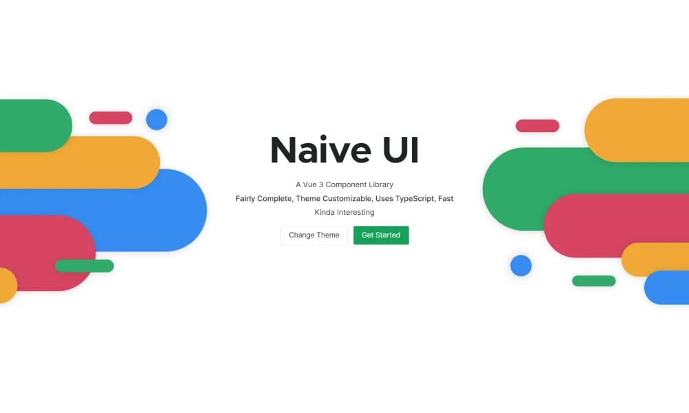
Naive UI is a Vue 3 component library recommended by Evan You, offering beautiful, high-performance, and highly customizable components, entirely written in TypeScript.
Product Overview
Naive UI provides a very comprehensive and high-quality collection of UI components, covering a wide range from basic buttons, input fields, selectors, forms to complex tables, tree controls, calendars, notifications, modals, and more, meeting the needs of most application scenarios.
Best For
Teams building scalable, consistent digital products.
Key Features
- Comprehensive component library
- Design tokens
- Documentation included
- Theme customization
Pros
- +Comprehensive design system
- +Professional-quality output
Cons
- -Adoption requires team alignment
- -Customization can be complex
/// SPECS
- Pricing:Free
Vuetify
Vuetify is a complete Vue.js UI framework that strictly adheres to Material Design guidelines, offering a rich set of components and powerful customization capabilities.
shadcn/ui
shadcn/ui is a unique collection of composable React UI components, offering copy-and-paste code that is highly customizable and seamlessly integrates with Tailwind CSS.
Animate UI
Animate UI is a free open-source React component library with Tailwind and Framer Motion animations, inspired by shadcn/ui, to effortlessly elevate web interfaces.

AWS Amplify
Figma components for building Amplify-powered apps with consistent AWS design language.
Airtable UI Kit
Figma components for designing Airtable-integrated apps with consistent UI patterns.

Flowbite Design System
open-source Tailwind CSS component library with Figma kit for rapid UI building.
Ant Design
Ant Design is an enterprise-level UI design language and React component library, providing high-quality UI solutions to help build elegant and efficient enterprise products.

Chakra UI
Chakra UI is a simple, modular, and accessible React UI component library, focused on enhancing developer experience and providing highly customizable building blocks.

Hero UI
Beautiful, fast and modern React UI library for building accessible and customizable web applications.

Wix Design System
comprehensive Figma library of UI components and guidelines for consistent Wix app designs.
Element Plus
Element Plus is a desktop UI component library designed for Vue 3, offering rich, elegant enterprise-grade components to efficiently build management systems.