
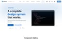
Flowbite Design System
open-source Tailwind CSS component library with Figma kit for rapid UI building.
Product Overview
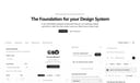
Flowbite is a popular open-source UI component library built on Tailwind CSS, providing ready-to-use interactive elements like buttons, modals, dropdowns, navbars, forms, tables, and dark mode support for fast web development. It includes a comprehensive Figma design system kit for prototyping, making it ideal for designers and developers creating modern, responsive applications. With over 400 components, Flowbite Pro offers premium features, while the core remains free and community-driven. Tailwind Components: 400+ utility-first elements with JavaScript plugins for interactivity (e.g., dropdowns, carousels). Figma Kit: Official community file for design-to-code workflow. Dark Mode & Accessibility: Built-in support with ARIA compliance. Pro Version: Advanced blocks, templates, and Figma Pro kit.
Best For
Figma Kit: Official community file for design-to-code workflow. Dark Mode & Accessibility: Built-in support with ARIA compliance. Pro Version: Advanced blocks, templates, and Figma Pro kit.
Key Features
- Tailwind Components: 400+ utility-first elements with JavaScript plugins for interactivity (e.g., dropdowns, carousels).
- Figma Kit: Official community file for design-to-code workflow.
- Dark Mode & Accessibility: Built-in support with ARIA compliance.
- Pro Version: Advanced blocks, templates, and Figma Pro kit.
Pros
- +Free to use
- +Open source
- +Ready-to-use templates
- +Comprehensive design system
Cons
- -Adoption requires team alignment
- -Customization can be complex
/// SPECS
- Pricing:Free
- Platform:Browser
Vuetify
Vuetify is a complete Vue.js UI framework that strictly adheres to Material Design guidelines, offering a rich set of components and powerful customization capabilities.
shadcn/ui
shadcn/ui is a unique collection of composable React UI components, offering copy-and-paste code that is highly customizable and seamlessly integrates with Tailwind CSS.
Carbon Design System
IBM's open-source UI framework for consistent, accessible enterprise products.
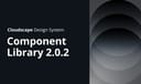
Cloudscape Design System
AWS open-source UI framework for consistent, accessible enterprise cloud applications.

Elastic UI
open-source React framework for consistent, accessible enterprise interfaces.
Evergreen
open-source React UI framework by Segment for consistent, accessible enterprise applications.
SAP Design System
open-source framework for consistent, accessible enterprise UI across SAP products.

Forma 36 Design System
Contentful's open-source design system for consistent, accessible content management interfaces.

Friday Design System
open-source Figma UI kit for rapid prototyping with customizable components.

GOV.UK Design System
official UK government framework for consistent, accessible public service interfaces.

Hero UI
Beautiful, fast and modern React UI library for building accessible and customizable web applications.

Fluent UI
Microsoft's open-source UI framework for consistent, accessible experiences across web, Windows, iOS, Android, and macOS.

Naive UI
Naive UI is a Vue 3 component library recommended by Evan You, offering beautiful, high-performance, and highly customizable components, entirely written in TypeScript.

Goldman Sachs Design System
internal framework for consistent, accessible enterprise financial interfaces.

Element Plus
Element Plus is a desktop UI component library designed for Vue 3, offering rich, elegant enterprise-grade components to efficiently build management systems.