Screensiz.es
Comprehensive reference for device screen sizes and resolutions
Product Overview
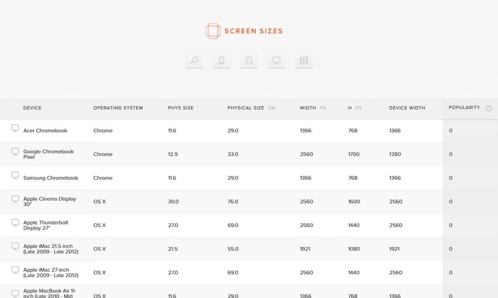
Screensiz.es is a comprehensive reference website that provides detailed information about device screen sizes, resolutions, pixel densities, and physical dimensions across a wide range of popular devices. From smartphones and tablets to monitors and smartwatches, it covers everything you need for responsive design planning. Each device entry includes display type, aspect ratio, DPI, and viewport dimensions in both pixels and CSS units.
Best For
Web and mobile designers and developers who need accurate device specifications for responsive design and testing
Key Features
- Complete database of device screen sizes from phones to large monitors
- Detailed specs including resolution, DPI, aspect ratio, and viewport size
- Search and filter by device type, brand, and screen characteristics
- Comparison view to see multiple devices side by side
- Physical dimensions in millimeters alongside pixel measurements
- Regularly updated database with new device releases
Pros
- +Comprehensive and well-organized device data
- +Useful for responsive design breakpoint planning
- +Clean interface with easy navigation and search
Cons
- -No API for programmatic access
- -Some newer devices may be missing from the database
/// SPECS
- Pricing:Free
- Platform:Web

Umanmade
A curated directory of digital work made by real humans, not AI
PostSpark
Online image beautification with borders, shadows, and mockups

Simple.ink
Beautiful design documentation and handoff platform

Qingtu
Screenshot beautification, annotation and sharing tool

Same.energy
AI-powered visual search for similar style and composition
Recent Design
Curated design inspiration from X (Twitter), updated daily

VectorWiki
Search engine for thousands of free SVG vector icons
ClipDrop Image Upscaler
AI-powered image upscaling up to 4x resolution

Macaron
Free collection of SVG UI elements and design assets

Checklist Design
Curated checklists for every stage of design
Icon Museum
Curated gallery of classic iOS app icons
Before.click
Curated App Store screenshots gallery for ASO inspiration

Screenshots Club
Free App Store screenshots library — 3.5M+ screenshots from 400K+ apps

Meiye Works
Chinese online portfolio platform for designers
GitHub.cards
Generate beautiful GitHub profile data cards
LOGGGOS
Curated logo design inspiration gallery