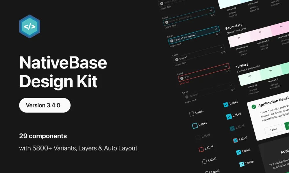
NativeBase Design System
open-source UI component library for React Native with customizable, accessible cross-platform designs.
Product Overview
NativeBase is an open-source, universal design system and UI component library for React Native and web, enabling developers to build consistent, accessible, and performant mobile and web applications with ready-to-use components. It supports theming, dark mode, and platform-specific adaptations (iOS/Android/web), making it ideal for cross-platform development without separate codebases. With over 50k GitHub stars, it's widely used for rapid prototyping and production apps, offering extensive customization through theme tokens and utility props. Component Library: 40+ pre-built components like buttons, forms, cards, navigation, modals, and lists with variants. Theming: Highly customizable themes using tokens for colors, typography, spacing, and shadows. Accessibility: Built-in ARIA support, focus management, and screen reader compatibility. Cross-Platform: Works seamlessly on React Native (iOS/Android) and web (React). Tools: NativeBase Provider for global theming; integration with Expo and Next.js.
Best For
Teams building scalable, consistent digital products.
Key Features
- Component Library: 40+ pre-built components like buttons, forms, cards, navigation, modals, and lists with variants.
- Theming: Highly customizable themes using tokens for colors, typography, spacing, and shadows.
- Accessibility: Built-in ARIA support, focus management, and screen reader compatibility.
- Cross-Platform: Works seamlessly on React Native (iOS/Android) and web (React).
- Tools: NativeBase Provider for global theming; integration with Expo and Next.js.
Pros
- +Open source
- +Color palette generation
- +Accessibility contrast checking
- +Comprehensive design system
Cons
- -Adoption requires team alignment
- -Customization can be complex
/// SPECS
- Pricing:Free
- Platform:Browser / iOS / Android

Horizon Design System
HashiCorp's open-source design system for consistent, accessible cloud management interfaces.
Material Design
Google's open-source design system for consistent, intuitive interfaces across platforms.

Microsoft Teams UI Kit
Figma-based components and templates for designing consistent Teams apps.
Figma UI2
Figma's official design system for consistent, accessible product interfaces.

Moon Design System
open-source UI framework for consistent, customizable digital experiences.

NewsKit
News UK's open-source design system for consistent, accessible digital news experiences.
Orbit
Kiwi.com's open-source design system for consistent, accessible travel booking interfaces.

Pajamas
GitLab's open-source design system for consistent, accessible interfaces across products.

Palmetto Design System
open-source design system for consistent, accessible solar energy product interfaces.

gluestack-ui
open-source universal React UI library with customizable, accessible components for web and native apps.